
Why Design Vocabulary Matters for Homeowners
You don't need a design degree to create a home that feels intentional and comfortable. But when you pick up a decorating guide or scroll through inspiration images, the terminology can feel like a foreign language. Knowing what words like visual weight, scale, or vignette actually mean transforms abstract concepts into tools you can use.
This reference covers the terms you'll encounter most often — explained plainly, with practical context for how each applies to real rooms. Think of it as a design dictionary built specifically for everyday homeowners.
| Typical room color palette size | 3–5 colors (Common interior design practice) |
| Recommended main walkway width | At least 36 inches (General accessibility and design guideline) |
| Rule of odds in styling | Group objects in odd numbers (3, 5, 7) (Standard decorating principle) |
| Eye-level art hanging height | Center of artwork at approx. 57–60 inches from floor (Gallery and interior design convention) |
| Rug sizing guidance | All main furniture legs should sit on or just off the rug (Common interior design rule of thumb) |
Core Concepts: The Building Blocks of Any Room
Most design decisions come back to a handful of foundational ideas. Balance determines whether a room feels settled or chaotic. Achieving it doesn't require matching sets of furniture — asymmetrical balance, where different objects carry equal visual weight on either side of a space, is just as effective and often more interesting.
Scale and proportion are perhaps the most commonly misunderstood concepts for first-time decorators. A sofa that's too small for a large living room will always look awkward, no matter how beautiful it is on its own. When in doubt, measure your space and compare those dimensions against furniture before committing.
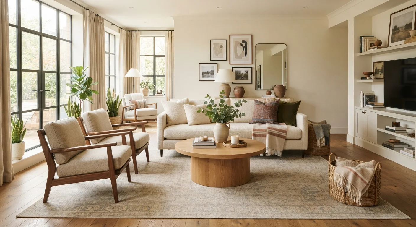
Focal points anchor a room and give the eye somewhere to land. If your room lacks a natural focal point like a fireplace or large window, you can create one with a gallery wall, an oversized mirror, or a bold piece of furniture. Once your focal point is established, other elements in the room can support it rather than compete with it.
Visual Weight
The sense of heaviness or lightness a design element conveys to the eye, regardless of its actual physical mass. Darker colors, complex patterns, and larger shapes carry more visual weight than lighter, simpler ones.
Negative Space
The empty or open areas surrounding objects in a room or on a surface. Intentional negative space prevents visual clutter and gives the eye a place to rest, making the objects that are present feel more purposeful.
Scale and Proportion
Scale refers to the size of an object relative to the room; proportion describes the size relationship between objects to each other. A common beginner mistake is placing furniture or art that is too small for the space.
Focal Point
The dominant visual anchor of a room — the element your eye naturally lands on first. It might be a fireplace, a large piece of art, or a statement piece of furniture.
Rhythm
The repetition of colors, shapes, patterns, or textures throughout a space to create visual flow and a sense of cohesion. Rhythm guides the eye from one area of a room to another in a pleasing way.
Color Palette
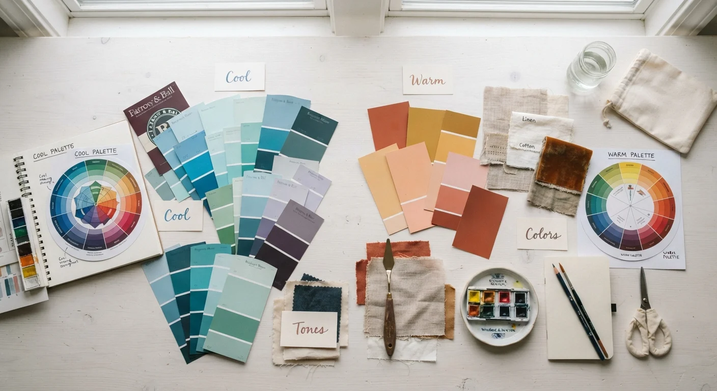
The selected collection of colors used consistently throughout a room or home. A typical room palette includes a dominant color, a secondary color, and one or two accent colors.
Layering
The practice of combining multiple textures, materials, and decorative elements at varying depths and heights to add dimension and warmth. Layering rugs, pillows, and throws is a common example.
Traffic Flow
The natural paths people walk through a room. Good furniture arrangement accommodates traffic flow by keeping pathways clear — typically at least 36 inches wide in main walkways.
Vignette
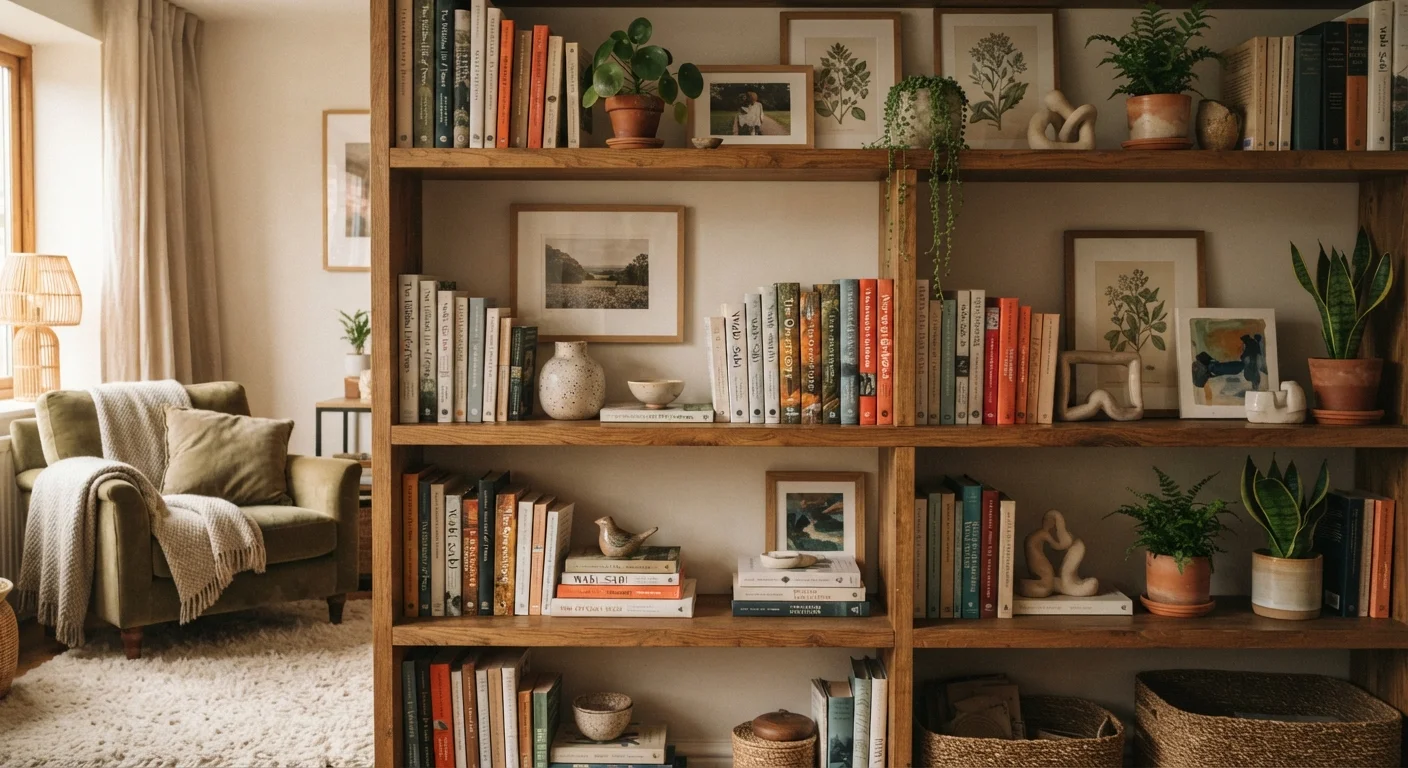
A small, intentional arrangement of objects — often on a tabletop, shelf, or tray — that tells a visual story. A well-composed vignette typically includes items of varying heights, textures, and one personal element.
Undertone
The subtle hue beneath a paint or fabric color that emerges under different lighting conditions. A 'white' wall may have warm (yellow or pink) or cool (blue or gray) undertones that affect how the entire room feels.
Balance
The even distribution of visual weight in a room. Symmetrical balance mirrors elements on either side of a central axis; asymmetrical balance achieves equilibrium using different but equally weighted objects.
Accent Color
A bolder or contrasting color used in small doses to add visual interest and energy to a room. Accent colors typically appear in pillows, art, or small decorative objects rather than walls or large furniture.
Styling Terms You'll See in Decorating Guides
Vignettes are one of the most accessible styling techniques for homeowners. A well-arranged grouping of three to five objects on a side table — varying in height, material, and texture — instantly looks more considered than a random collection. When you're styling a bookshelf, vignette thinking applies to each section of the shelf.
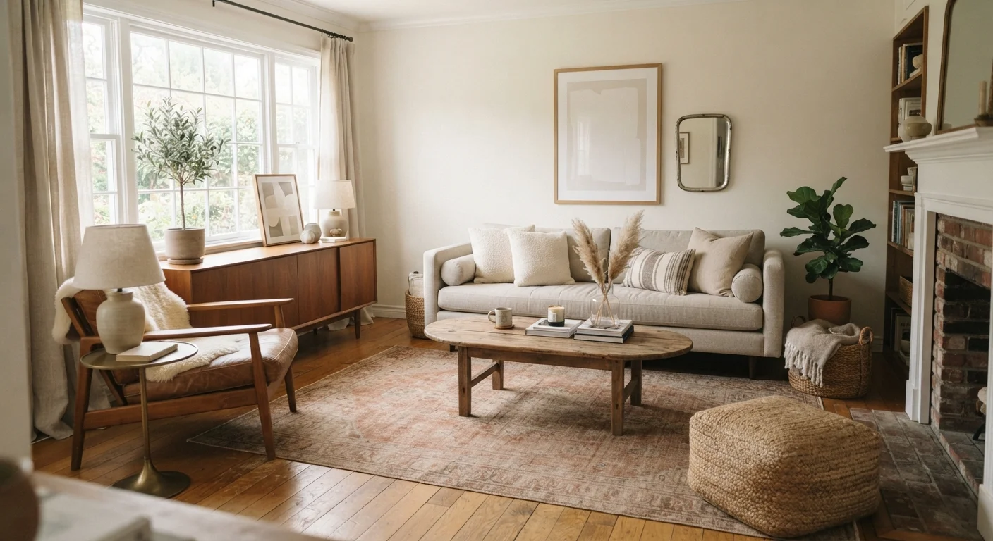
Layering adds depth and warmth that a sparsely furnished room often lacks. It doesn't require buying more — it's about combining what you have thoughtfully. A jute rug layered under a smaller woven rug, a linen throw over a leather sofa, or a mix of matte and shiny objects on a shelf all create that lived-in, layered look.
Rhythm works in rooms the same way it works in music: repeating a color, material, or shape in different places creates a sense of flow and intention. If you have a mix of secondhand and new pieces, using rhythm — a consistent metal finish, a recurring warm wood tone — is what pulls them together.
These Terms Apply Beyond Interiors
Many design concepts — such as balance, scale, and rhythm — originate in fine art and architecture. Once you understand them in a home context, you'll start noticing them everywhere: in garden design, graphic layouts, and even how a table is set. If you're learning about color concepts specifically, our guide on color theory for non-designers goes deeper on palettes and undertones.
Space and Layout Terminology
Negative space is one of the most underused tools in home decorating. Overcrowded rooms feel stressful; rooms with intentional open areas feel calm and polished. Negative space isn't empty — it's doing important work by letting the objects you've chosen stand out. On a shelf, it's the clear space beside a stack of books. In a room, it's the area of floor or wall you've deliberately left open.
Traffic flow is a practical concern that also shapes how a room feels. Furniture arrangements that force people to squeeze through tight gaps create tension, even subconsciously. Before finalizing a furniture layout, walk through the room and note where movement feels natural and where it feels blocked.
Visual weight helps explain why some rooms feel heavy even when they aren't full. A dark sofa, a patterned rug, and a heavily framed gallery wall all carry significant visual weight. Balancing them with lighter elements — pale walls, simple linens, unframed prints — keeps the room from feeling oppressive. Once you start noticing visual weight, it becomes one of your most useful instincts as a decorator. For more on how color affects room feel, see our guide on choosing colors with confidence.
57–60"
Standard art hanging height from floor
This eye-level convention is used by galleries and interior designers alike to ensure artwork feels grounded in a space.
60-30-10
Classic color distribution rule
Designers commonly suggest 60% dominant color, 30% secondary, and 10% accent for a balanced, cohesive palette.