
Why Bookshelf Styling Is Worth Your Attention
A bookshelf is one of the most personal surfaces in any home — it holds your reading history, your interests, and often your collections. But when everything competes for attention at equal volume, a shelf stops reading as curated and starts reading as chaotic.
The good news is that thoughtful shelf styling doesn't require an interior decorator or a big budget. It requires a few principles. Whether you have built-ins, a freestanding unit, or a single floating shelf, the same core ideas apply. If you're weighing whether open shelving suits your lifestyle at all, open shelving vs. closed cabinets is worth thinking through first.
Core Principles for a Shelf That Looks Intentional
These aren't rigid rules — think of them as a reliable framework you can adapt to your space and aesthetic.
Mix vertical and horizontal book orientations on every shelf.
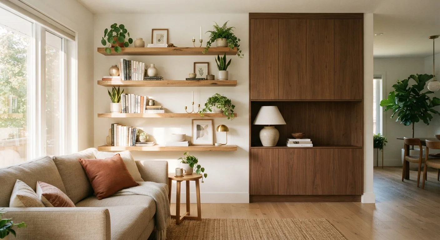
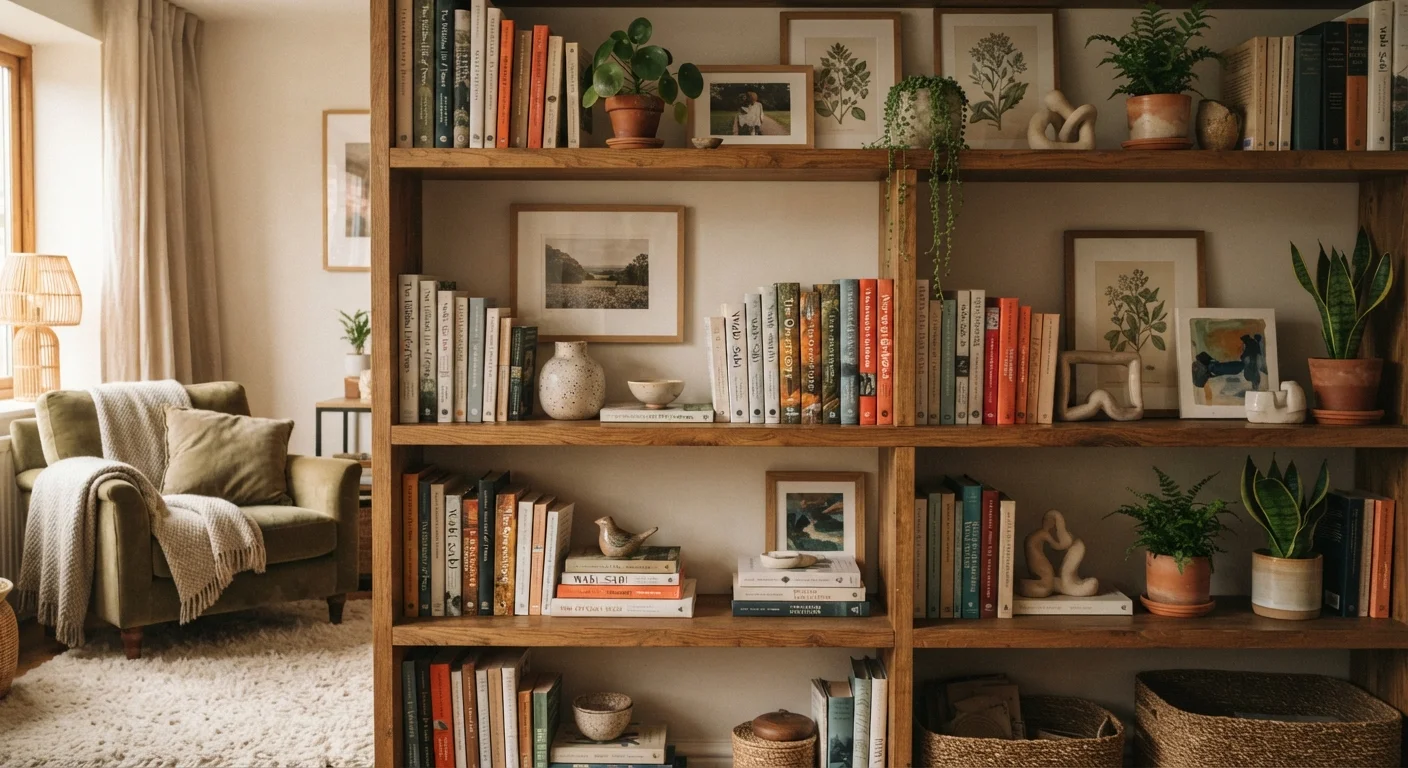
Rows of uniformly upright books create a flat, one-note look. Alternating with horizontal stacks introduces height variation and gives you a natural platform for small objects like a candle or a small plant.
Group decorative objects in odd numbers, ideally threes.
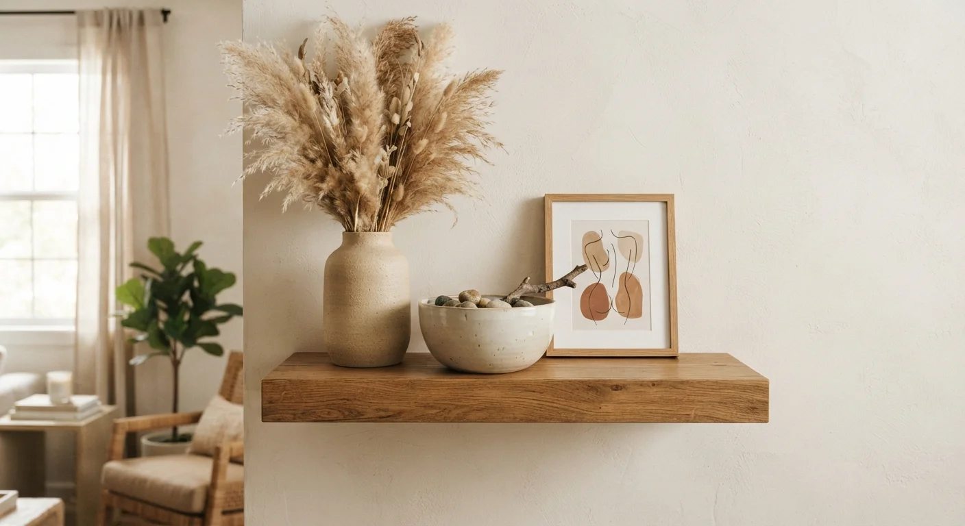
Odd-numbered groupings feel organic and dynamic because the eye moves naturally between them rather than splitting the arrangement into equal halves. This is one of the most consistently reliable principles in interior styling.
Vary the height of objects within each shelf section.
When every item sits at the same height, the shelf reads as flat. Mixing tall, medium, and short pieces creates a skyline effect that draws the eye across the shelf rather than past it.
Layer items front to back, not just side to side.
Depth is often overlooked on shelves. Placing a smaller object in front of a larger one adds dimension and creates the impression of a thoughtfully layered display rather than objects simply lined up.
Deliberately leave empty space on each shelf.
Negative space allows individual pieces to stand out. Without it, even beautiful objects blend into visual noise. Think of empty shelf space the way a gallery thinks of wall space — it's part of the composition.
Repeat a color, material, or shape across multiple shelves.
Repetition creates rhythm and visual cohesion across an entire shelving unit. A consistent element — brass tones, terracotta, dark-spined books — acts as a visual thread that ties disparate objects together.
Quick Wins You Can Do This Weekend
You don't need to restyle every shelf at once. Start with one section and work outward. These fast actions produce visible results with minimal effort.
Color, Texture, and the Role of Negative Space
One of the most underused tools in shelf styling is restraint. Negative space — the empty stretches between objects — gives the eye a place to rest and makes the pieces you do display feel more significant.
The Empty Shelf Test
Before adding anything back after a re-style, live with a largely empty shelf for a day. Notice how the space feels. Then add items back one at a time, stopping before it feels full. The point at which you hesitate is often the right stopping point.
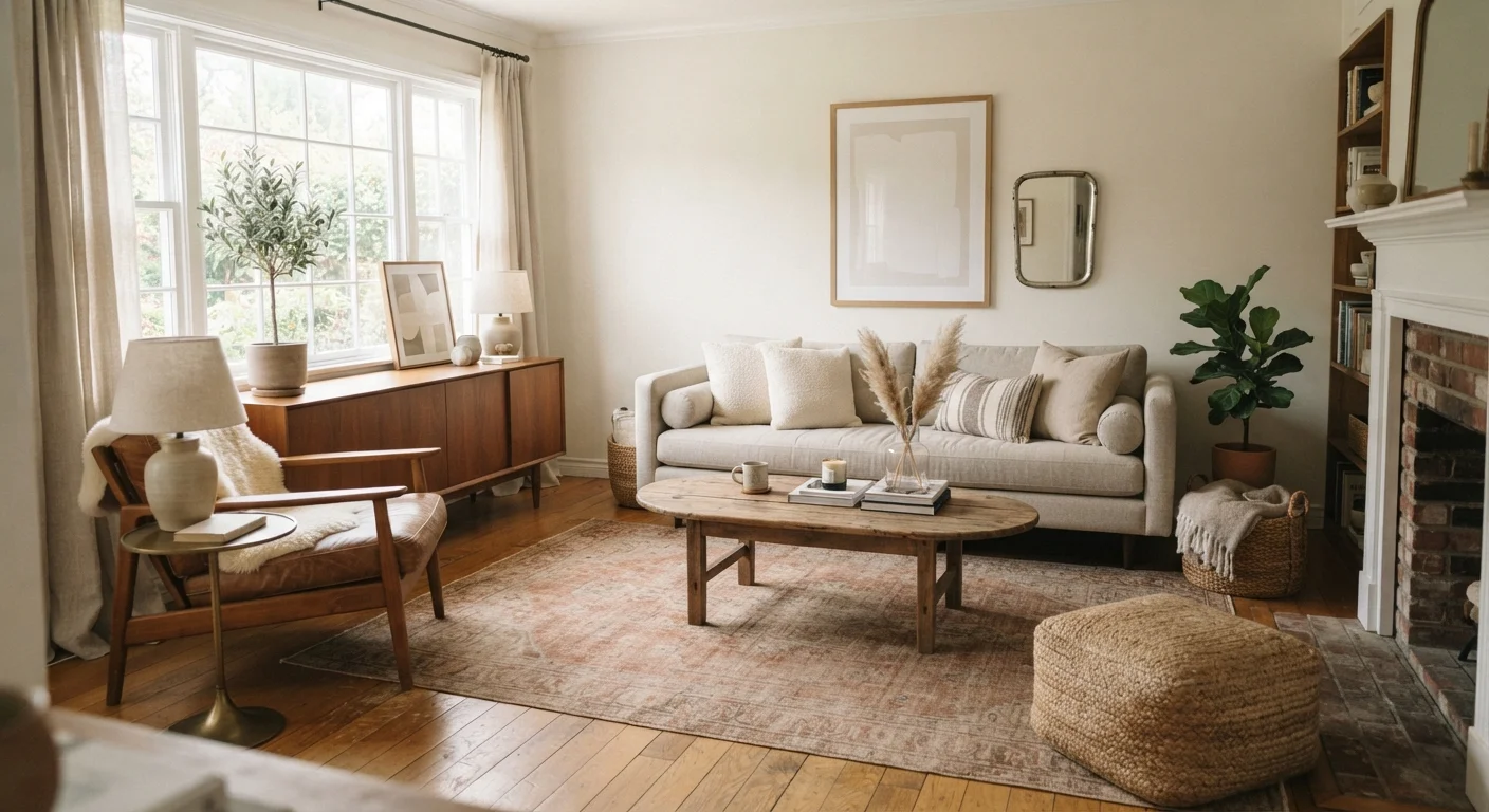
Color cohesion matters too. You don't need to color-block all your books (though that's a valid approach), but limiting the range of tones across a shelf — say, warm neutrals, muted greens, and natural wood — creates unity even when the objects themselves are eclectic. This is especially useful when working with secondhand or inherited pieces, which can look beautifully pulled-together with a unifying color thread. For more on that challenge, see making secondhand pieces feel cohesive.
Texture rounds out what color organizes. A smooth ceramic vase next to a rough-spined hardcover next to a trailing plant introduces contrast that keeps the eye interested. The goal isn't matching — it's a deliberate mix.
For a deeper look at why odd-number groupings feel so natural, the rule of three in home decor explains the underlying principle and how to apply it across your whole home.
68%
Homeowners who style shelves with non-book objects
According to a Houzz survey on living room decorating habits, most homeowners mix books with decorative accessories on their shelving rather than using shelves exclusively for books.
3–5
Ideal objects per shelf vignette
Interior styling guides consistently suggest keeping each shelf section to three to five items to maintain visual balance and prevent a crowded appearance.
Avoiding the Most Common Mistakes
Even with good intentions, a few habits can undermine an otherwise well-styled shelf:
- Filling every inch: A jam-packed shelf looks overwhelmed. Aim to keep roughly 20–30% of each shelf visually open.
- All books spine-out at the same height: Monotony kills visual interest. Vary heights, turn some books spine-in for texture, and create horizontal stacks as platforms for objects.
- No focal anchor: Each shelf section benefits from one slightly larger or more visually distinct piece that anchors the grouping — a tall vase, a framed photo, or a sculptural object.
- Ignoring the shelf as a whole: Step back and look at the entire unit, not just individual shelves. The visual weight should feel roughly balanced across the full structure — not all heavy pieces clustered at the top.
If you're drawn to bold, layered, object-rich displays, living with maximalism offers an honest look at when more becomes too much.
Styling Evolves With You
There's no permanent correct arrangement for a bookshelf. Collections grow, tastes shift, and seasonal adjustments — swapping in winter-toned objects or spring greenery — keep a shelf feeling fresh. Think of shelf styling as an ongoing practice rather than a one-time project.