
Why secondhand rooms often feel disjointed — and how to fix it
A room furnished entirely with secondhand, inherited, or thrifted pieces is often full of character. The challenge isn't the quality of the individual items — it's the absence of a shared visual language between them. Each piece was chosen or made for a different context, and without a deliberate framework, a room can read as accidental rather than assembled.
The good news: cohesion doesn't require everything to match. It requires a few consistent design decisions repeated throughout the space. Color, material, and scale are the three levers you'll use most. Pull them consistently, and your room will feel designed — not just filled. If you're curious how professional decorators approach grouping and arrangement, our article on the rule of three in home decor explains the underlying logic clearly.
What you will need
Before diving into the steps, gather your tools and materials:
Color swatch cards or a free paint-chip app
Helps you identify and test a unifying color palette across your existing pieces.
Painter's tape
Useful for mapping out furniture placement on the floor before committing to a layout.
Sandpaper and wood stain or paint
Allows you to refinish or recolor wood furniture so disparate pieces share a closer tone.
Area rug
Grounds a seating area and visually unifies pieces that sit on it regardless of their style origin.
Throw pillows and blankets
Introduce repeating colors and textures that thread through unrelated furniture styles.
Step-by-step: Building cohesion from mixed pieces
Follow these steps in order — each one builds on the last. You don't need to complete them all in a single session; most homeowners find it helpful to work through Steps 1–2 on one day and Steps 3–6 as they shop or edit over the following week or two.
Photograph and catalog what you have
Before moving anything, photograph every piece of secondhand furniture you own. Lay the photos side by side — on a table, a mood board app, or even printed out — so you can see the full picture at once. Note each piece's dominant color, wood tone, metal finish, and approximate style (mid-century, farmhouse, traditional, industrial, etc.).
This bird's-eye view reveals natural groupings and obvious clashes that are easy to miss when you're standing in a room surrounded by the furniture itself.
Choose one unifying color palette
Pick two to four colors that will anchor every room. These don't need to match your furniture exactly — they guide your accent choices and help the eye move comfortably through the space. Neutral backgrounds (warm white, greige, soft sage) tend to make eclectic furniture collections feel curated rather than chaotic.
Once your palette is set, apply it through soft goods: curtains, throw pillows, rugs, and artwork. These are the least expensive and most reversible ways to tie together pieces that differ in era or style. For more on how to layer these elements, see our guide on adding texture without renovating.
Identify and repeat one or two materials
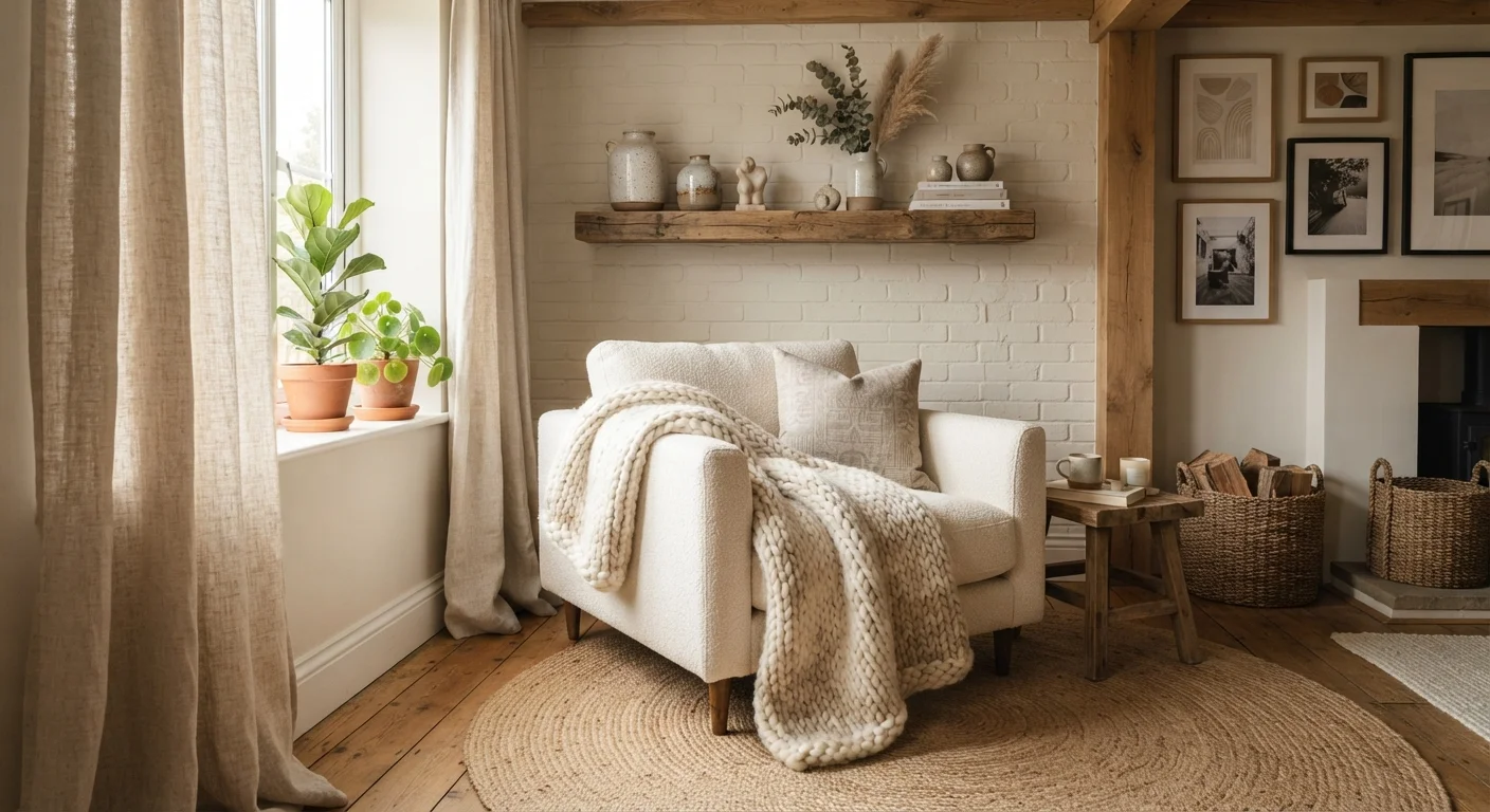
Material repetition is the quieter cousin of color coordination, and it works just as well. Scan your catalog for recurring elements: warm-toned wood, black metal hardware, rattan, brass, or natural linen. Choose one or two and reinforce them deliberately.
For example, if three of your pieces have warm oak undertones, a fourth piece in raw pine can be stained slightly darker to match. If two lamps have black metal bases, a small black-framed mirror adds a third anchor point. Repetition of even a small detail signals intention rather than accident.
Ground each zone with a rug
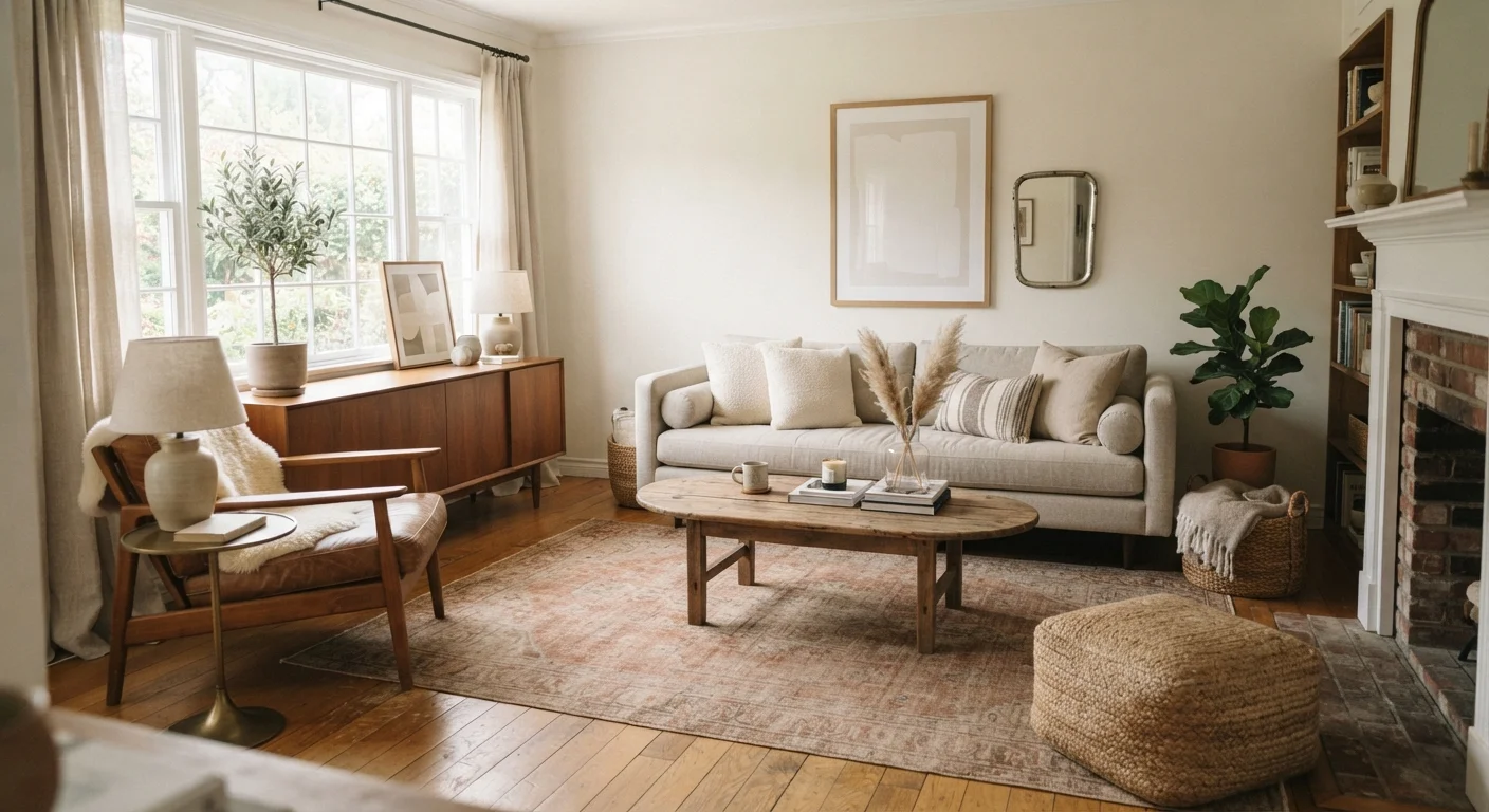
In open-plan rooms or spaces with several distinct furniture pieces, an area rug is one of the most effective unifiers available. A rug placed beneath — or partially beneath — a seating group visually declares that those pieces belong together, regardless of their individual origins.
Choose a rug that pulls from two or more colors in your palette. It doesn't need to be large; it needs to be purposeful. In a living room, the front legs of a sofa and chairs resting on the rug is typically enough to create that sense of grouped intention.
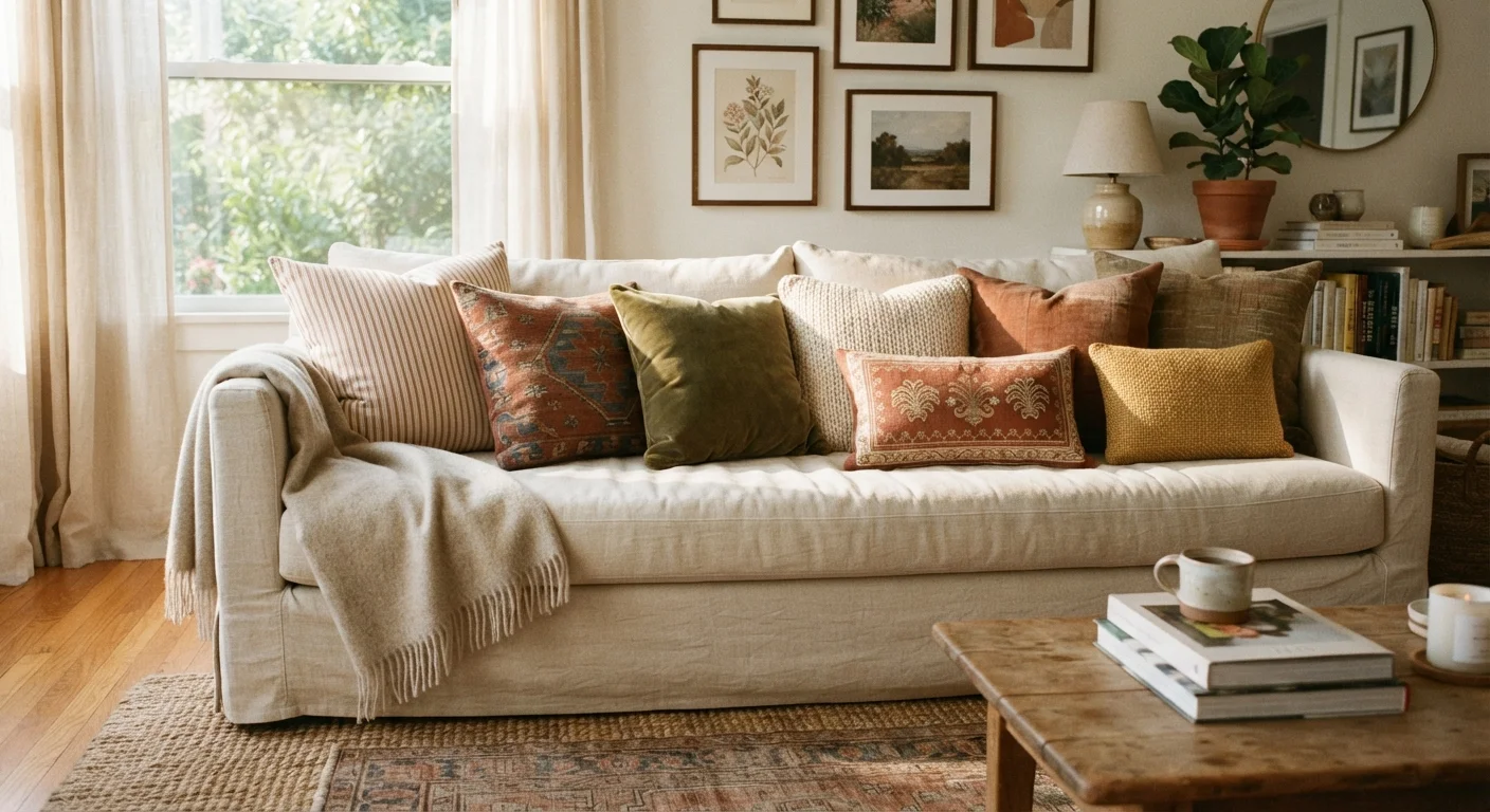
Use throw pillows and textiles as connective thread
Throw pillows, blankets, and curtains are the decor equivalent of a common thread — they can appear on a mid-century chair, a traditional sofa, and a hand-me-down daybed, connecting them through repeated color or texture. See our room-by-room guide to choosing throw pillows for sizing and quantity guidance.
Stick to your established palette when choosing these. Two pillows in a consistent color placed on an otherwise mismatched piece can immediately pull it into the room's visual conversation.
Edit ruthlessly — remove before you add
The most common mistake when styling a room full of secondhand pieces is overcrowding. When every item has sentimental or thrift-find value, it's tempting to display everything. But a space with too many competing pieces will always feel like a storage room rather than a designed room.
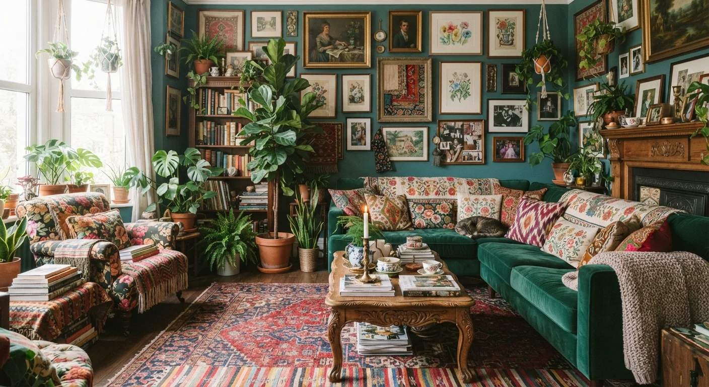
Walk through your layout with fresh eyes — or ask someone else to — and identify the one or two pieces that are fighting the rest. Store them, donate them, or repurpose them in another room. Less competition between pieces lets the ones you love actually read as intentional. For perspective on the line between curated abundance and visual overwhelm, our article on living with maximalism is worth a read.
Style one corner first
If the full room feels overwhelming, start with a single corner or vignette. Pull together three pieces that share at least one quality — a color, a material, a similar scale — and style that zone completely before moving on. A finished corner gives you a proof of concept and builds confidence for the rest of the room.
Once you've worked through these steps, you may also find it useful to explore styling bookshelves beyond alphabetical order — the same principles of repetition, editing, and intentional grouping apply directly to shelf displays filled with secondhand finds and collected objects.
When styles genuinely clash: knowing when to let a piece go
Not every secondhand piece can be made to work in every space. Sometimes a piece is simply incompatible — wrong scale, wrong undertone, wrong visual weight — and no amount of throw pillows will bridge the gap. Understanding the differences between decorating styles that look similar can help you identify whether two pieces are genuinely at odds or just need a styling bridge.
If a piece consistently draws the eye for the wrong reasons — if visitors notice it as 'the thing that doesn't fit' — it's worth reconsidering its placement. That doesn't mean discarding it. Move it to a different room where its style lands more naturally, or use it as a functional piece (extra seating stored in a closet, a side table in a bedroom) rather than a display item.
Watch out for scale mismatches
The most common reason a secondhand room feels 'off' isn't color or style — it's scale. A massive inherited armoire next to a delicate mid-century side table creates visual imbalance that no amount of coordinated textiles will fully correct. Before committing to a layout, step back and assess whether your largest and smallest pieces feel proportionate to each other and to the room itself.
Renters working with secondhand furniture have an additional layer to consider — wall treatments, permanent adhesives, and floor-level changes may affect your lease. Our guide to decorating a rental without losing your deposit covers the key constraints to keep in mind.