
The Color Wheel: Your Starting Point
The color wheel is simply a circular diagram that organizes colors by their visual relationships. It was formalized by artists and scientists over centuries, but you don't need any of that history — just the basics.
Hue
The pure, base color itself — red, blue, green — before any white, black, or gray is added.
Tint
A hue with white added to it, making it lighter. Pink is a tint of red.
Shade
A hue with black added to it, making it darker. Navy is a shade of blue.
Saturation
How vivid or muted a color is. A highly saturated color looks intense; a low-saturation color looks dusty or grayed out.
Complementary colors
Colors positioned directly opposite each other on the color wheel, such as blue and orange. They create strong contrast when placed together.
Undertone
The subtle secondary hue hidden within a color — for example, a beige that has a faint pink or green cast beneath its surface appearance.
The wheel starts with three primary colors: red, yellow, and blue. Mix two primaries and you get a secondary color — orange, green, or violet. Mix a primary with an adjacent secondary and you get a tertiary color, like red-orange or blue-green. That's the whole structure.
Why does this matter for decorating? Because the wheel predicts which colors will harmonize and which will fight each other. Once you know where colors sit relative to each other, building a palette stops being guesswork. For a broader vocabulary of design concepts, see our interior design terminology guide.
Warm vs. Cool Tones
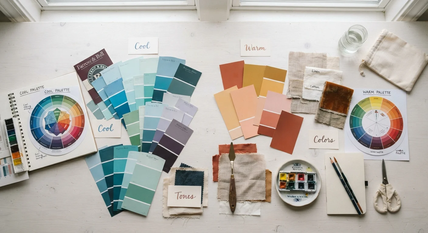
The color wheel is divided into two emotional halves. Warm colors — reds, oranges, and yellows — are associated with energy, coziness, and visual weight. They make walls feel like they're advancing toward you, which can make a large, chilly room feel more intimate.
Cool colors — blues, greens, and purples — feel calming and receding. They visually push walls back, which can help a smaller or stuffy room feel more open and airy.
Use Temperature to Control Room Mood
Before choosing any specific color, decide on the feeling you want to create. Warm tones work well in dining rooms and living areas where you want guests to feel welcome and relaxed. Cool tones suit bedrooms, bathrooms, and home offices where calm focus is the goal. Making this decision first narrows your palette immediately.
Neutrals — whites, grays, beiges, and taupes — aren't truly neutral. They lean warm or cool based on their undertones, which is covered in the next section. A gray with blue undertones will feel cool; a gray with yellow undertones will feel warmer and earthier.
Undertones: The Hidden Variable in Every Color
Undertones are the subtle secondary hue lurking beneath a color's surface. A beige paint can have pink, yellow, or green undertones. A white can read as creamy, icy, or faintly lavender. These hidden hues are what cause two seemingly similar swatches to look completely different once they're on a wall surrounded by your furniture and flooring.
To spot an undertone, don't look at the swatch in isolation. Compare it to a known reference: a pure white sheet of paper, your wood floors, or your sofa fabric. The relationship will reveal the undertone your eye was missing.
Mismatched Undertones Are the #1 Decorating Mistake
Buying a paint color you love in the store, only to have it clash with everything in your room, almost always comes down to undertones. Always compare swatches against your actual fixed materials — floors, cabinetry, and upholstery — in the room's specific lighting before committing to a color.
This is also why matching undertones across materials matters so much. If your wood floors have orange-red undertones and you choose a cool gray paint with blue undertones, the two will visually clash even though gray seems like a safe neutral. Warm floors generally pair better with warm-leaning walls.
How to Build a Color Palette
A color palette is just a curated set of colors that work together throughout a space. There are three reliable palette structures beginners can use:
- Complementary: Two colors directly opposite each other on the wheel (e.g., blue and orange). High contrast, bold, best used with one dominant and one accent.
- Analogous: Three to four colors sitting side by side on the wheel (e.g., yellow, yellow-green, green). Naturally harmonious and easy to live with.
- Monochromatic: Multiple shades, tints, and tones of a single hue. Cohesive and sophisticated; texture does the visual work.
A practical formula for distributing color in a room is the 60-30-10 rule: 60% dominant color (walls, large furniture), 30% secondary color (rugs, curtains, accent chairs), and 10% accent color (throw pillows, artwork, accessories). This mirrors proportion principles you'll also find in the rule of three in home decor.
Applying Color Theory to Your Home
Theory is only useful when it connects to a real room. Here's how to put what you've learned into practice before you open a single paint can.
- Identify your fixed elements first. Flooring, existing furniture, and countertops set the undertone direction you're working within — not against.
- Choose a palette structure based on the mood you want: analogous for calm, complementary for energy, monochromatic for elegance.
- Test large swatches on your wall. Paint 12×12 inch or larger samples and observe them at different times of day. Small chips from the store are deceptive — colors shift dramatically at scale.
- Bring texture into the equation. Matte surfaces absorb light and deepen color; glossy surfaces reflect light and brighten it. The same color in different finishes can read quite differently.
When you're ready to move from planning to painting, our room painting walkthrough covers prep and technique for a clean, professional-looking result. And if you want to extend your color skills to shelving displays, bookshelf styling principles shows how color grouping can make a shelf feel curated rather than cluttered.